Pixel-perfect TrueType font for tiny text
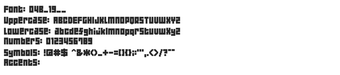
04b_19, by Yuji Oshimoto, is a pixel-based TrueType font that keeps micro-sized typography legible across desktop projects. It renders blocky, geometric glyphs intended for small-scale use, preserving hard pixel edges without smoothing, so text stays crisp in low-resolution art and tiny UI labels. The design emphasizes minimalism and consistent stroke weight, and produces a monospaced-like rhythm across Latin characters for uniform on-screen alignment. Pixel artists, retro web designers, and lo-fi developers get a compact typographic option tailored to micro-resolution layouts.
What the font changes about screen text
The font replaces conventional anti-aliased type with a deliberately blocky, pixel-aligned face that targets very small on-screen text. Distributed as a TrueType file, the font enforces hard pixel edges and a geometric, uniform stroke thickness so glyphs remain readable where standard fonts blur. The designer built the face to evoke early computer graphics and 8-bit displays, which means it alters the desktop by trading smooth curves for strict pixel fidelity.
How much control it gives over tiny-size rendering
The font is optimized for 9px rendering, so output depends on how the user configures the rendering pipeline. For predictable results use integer-size scaling and disable smoothing in the rendering tool. Recommended practices include:
- Set text at 9px or exact multiples
- Turn off font anti-aliasing in the application
How it integrates with desktop workflows and systems
Because the font ships as a standard .ttf file it installs through the system font manager and works in typical desktop applications. It does not run as a background process, so there is no persistent CPU or RAM overhead beyond normal font rendering. Compatibility covers Windows, macOS, and Linux that support TrueType fonts, and the file’s small footprint makes distribution and embedding in small projects straightforward.
A focused choice for pixel-focused designers with a licensing caveat
04b_19 is a practical option for designers seeking reliable micro-scale typography and a retro digital aesthetic. License descriptions vary between unknown and public-domain listings, so confirm usage terms before deploying in commercial work. Best suited to projects where strict pixel fidelity matters more than broad character coverage; pair it with pixel-aligned UI layouts or sprite-based assets for coherent results.